University Admissions & Financial Aid Website
Improve wayfinding and task completion to deepen engagement with top Johns Hopkins University undergrad candidates.
CLIENT
Johns Hopkins University
PARTNER
CAPABILITIES
Design Research, Experience Strategy
APPROACH
An extensive qualitative research study, analytics reviews, and competitive analysis formed the discovery phase for Johns Hopkins’s redesign of their undergraduate Admissions and Financial Aid websites. Interviews with over twenty prospective high school students and dozens of faculty and staff yielded a rich set of qualitative data. We synthesized these insights into a core set of Strategic Objectives which became the basis for a comprehensive set of Experience Principles to guide our work across three key categories: UX Design & Information Architecture, Branding & Storytelling, and Content Strategy. Finally, we began to define the new admissions experience through user journeys and site maps.
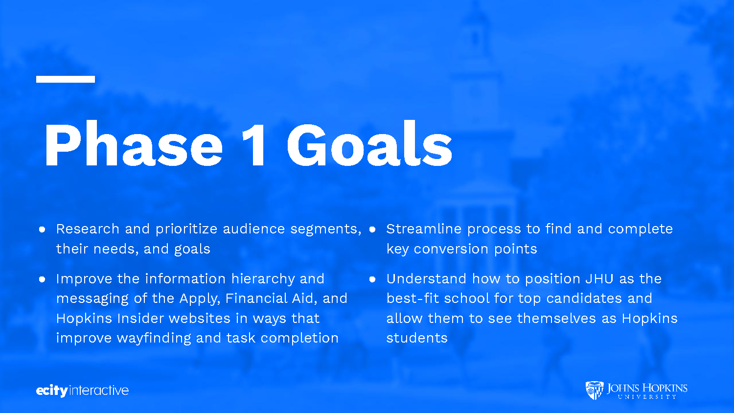
Discovery Phase: Johns Hopkins University was facing an array of challenges with their Undergraduate Admissions and Financial Aid websites. They knew they needed to improve basic wayfinding and task completion while streamlining paths to key conversion points. But they also needed to establish an ongoing dialogue with prospective students to sustain and deepen engagement – especially with first-generation college students and traditionally underrepresented demographics. Moreover, they would have to understand how to position JHU as the best-fit school for candidates considering Ivy League and other top-tier institutions.
User Research: We began user research by creating a Survey Monkey questionnaire that was sent to hundreds of prospective JHU students, across three primary personas (‘Achievers,’ ‘Navigators,’ ‘Trailblazers’). Using their responses, we selected a diverse array of candidates from each persona group for additional interviews. I drafted three versions of a User Interview Protocol (see above) for each of the three groups in order to learn more about their college search process, perceptions of Hopkins vis vis other top-tier academic institutions, and impressions of the existing websites.
Stakeholder Research: Through interviews and workshops we helped stakeholders prioritize goals, identify obstacles, and align their understanding of what a successful redesign would look like. I drafted the Stakeholder Interview Protocol to guide our conversations with Undergraduate Admissions, Financial Aid, Recruitment & Diversity, Marketing, Communications, and other key stakeholders.
Competitive Research: To supplement our understanding of user needs and business goals, I also conducted a review of direct and analogous competitor sites. Inspiration and precedent from these best-in-class sites would subsequently inform the recommendations put forward in our Experience Strategy.
Experience Strategy: Through collaborative work sessions with key Hopkins stakeholders, we synthesized eight Strategic Objectives to inform and guide our work.
Experience Strategy: Next, we laid out a comprehensive set of Experience Principles or foundational guidelines to ensure the subsequent phases of design work will meet our Strategic Objectives. Each Principle consists of some combination of insights and supporting data uncovered through research and synthesis: Example Recommendations, Competitive Inspiration & Precedent, User or Stakeholder Insights, and Heuristic Analysis of the current sites.
Experience Strategy: Experience Principles (cont'd).
Experience Strategy: Experience Principles (cont'd).
User Journeys: With a detailed understanding of the current prospective student process – and how our Experience Strategy could streamline and improve that process – I created detailed journey maps for each of the three primary personas. Using our qualitative research data, I defined what a hypothetical user would likely Do, Think, and Feel at each stage of the journey (Awareness, Consideration, Application, Decision). Key digital and physical touchpoints help to provide a full picture of what is happening outside of JHU-owned channels. And Engagement Goals and Metrics start to give definition to what success looks like at each step in the journey. Click image to download full file.
Site Map: Click image to download full file.
OUTCOME
My research and strategy laid a foundation and roadmap for the design and implementation work to come. Due to scheduling and budget constraints, I was unable to continue my collaboration with Johns Hopkins and Electric Kite on these subsequent phases of work. However, the updated site (see link below) implemented many of the recommendations laid out in my Experience Strategy (download full document here).


